


Reader Harry Grossman recently wrote Practical Sailor with an interesting question that we had never really considered before. Grossman wrote, I am red-green color blind, as are a fair number of other males. Am I the only one who has difficulty seeing your Value Guide marks when they are placed in the colored background?
As we regularly sail with some color-blind sailors (who are subscribers), we are sure Grossman isn’t the only color-blind PS reader out there who finds it challenging to decipher the red ratings symbols in our Value Guides when they are placed on a dark-blue background. We appreciate that Grossman-skipper of a Sabre 38 named Serenity, out of North Brunswick, N.J.-pointed this out to us.
In an effort to make it easier for those with color-blindness to interpret the PS Value Guide tables, weve decided to change the color of the symbols (dollar sign, star, and check mark) when they are placed on the dark background. Weve narrowed it down to a few options for alternatives, but wed like to get subscribers input on which is easiest to see clearly-and which looks the best.
Wed appreciate it if any of you-especially those who have color blindness-would take a moment to check out the sample Value Guides pictured here, choose which you think offers the easiest-to-decipher ratings symbols, and email us with your answer ([email protected]) or comment on this article at www.practical-sailor.com. The top vote-getter will become our new standard in future issues.
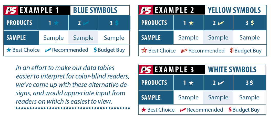
In an effort to make our data tables easier to interpret for color-blind readers, weve come up with these alternative designs, and would appreciate input from readers on which is easiest to view.


